New In-Play Experience
I led the redesign for the core GPS experience over 100,000 golfers use for every round.
Role
Lead Product Designer
Team
Product (PM, PO), Engineering (iOS/Android), QA
Timeline
6 Months
Company
Arccos Golf
Why This Project Mattered
The in-play GPS screen is the thing golfers look at on every hole, and for many, every shot. Roughly 40-70 times per round. Ours hadn't been meaningfully updated in eight years. It showed plenty of data but made it hard to actually do anything useful. The map was static and tough to read in sunlight. Fixing a misread shot meant digging through three levels of menus.
Many people just gave up and didn't fix their rounds, leading to poor data quality and thus poor insights.
Research & Discovery
We played a lot of golf using the old app and competitor apps, and spent over a week doing user interviews with golfers in our beta group.
A few things became clear early on:
Correcting shots felt like punishment. The app created its own tracking errors, then put all the burden on the user to fix them.
Office-designed interfaces don't survive the course. Sunlight, gloves, time pressure. A "clean" design that hides tools behind menus falls apart when someone has ten seconds between shots.
Anatomy of the Redesign
The redesign centers on three layers that work together: the Navigator at the top, the Contextual Tray at the bottom, and Action Buttons along the right edge. The map sits at the center.
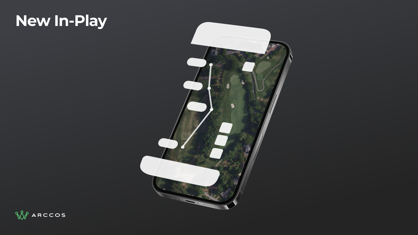
Exploded 3D view showing all three architectural layers (Navigator, Contextual Tray, and Action Buttons) surrounding the live map.
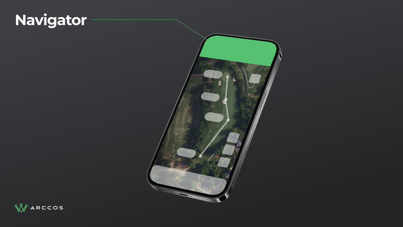
3D phone view highlighting the Navigator layer at the top of the screen.
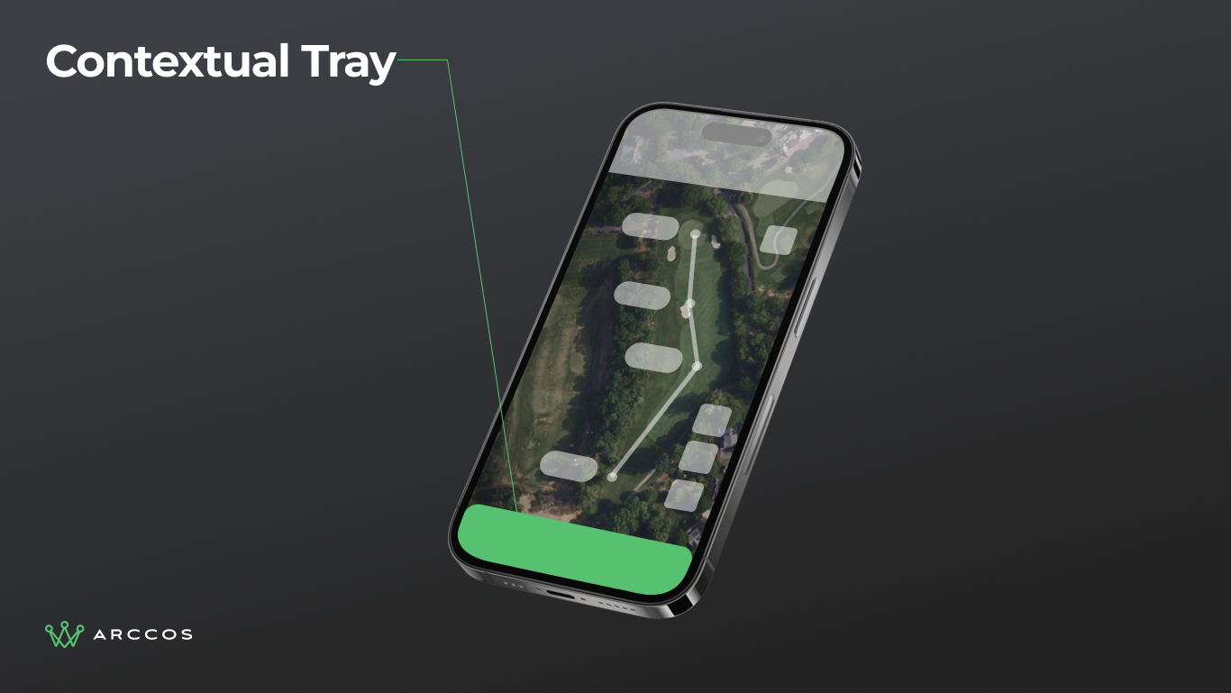
3D phone view highlighting the Contextual Tray layer at the bottom of the screen.
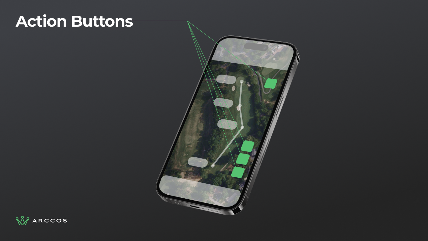
3D phone view highlighting the Action Buttons layer along the right edge.
Designed for the Course
Every visual decision traces back to a real constraint on the golf course.
Readability in any light. Key elements hit 13:1 and 8.5:1 contrast ratios, well above WCAG minimums. This was designed for direct sunlight, not a desk.
Glove-friendly targets. Every interactive element has a minimum 44px touch target. Buttons, yardage tags, hole selectors. All designed to be hit reliably with a golf glove on.
Functional color and type. Colors match real-world counterparts: green for fairway, sand for bunker. The typography hierarchy is optimized for arm's-length reading, not pixel-peeping on a monitor.
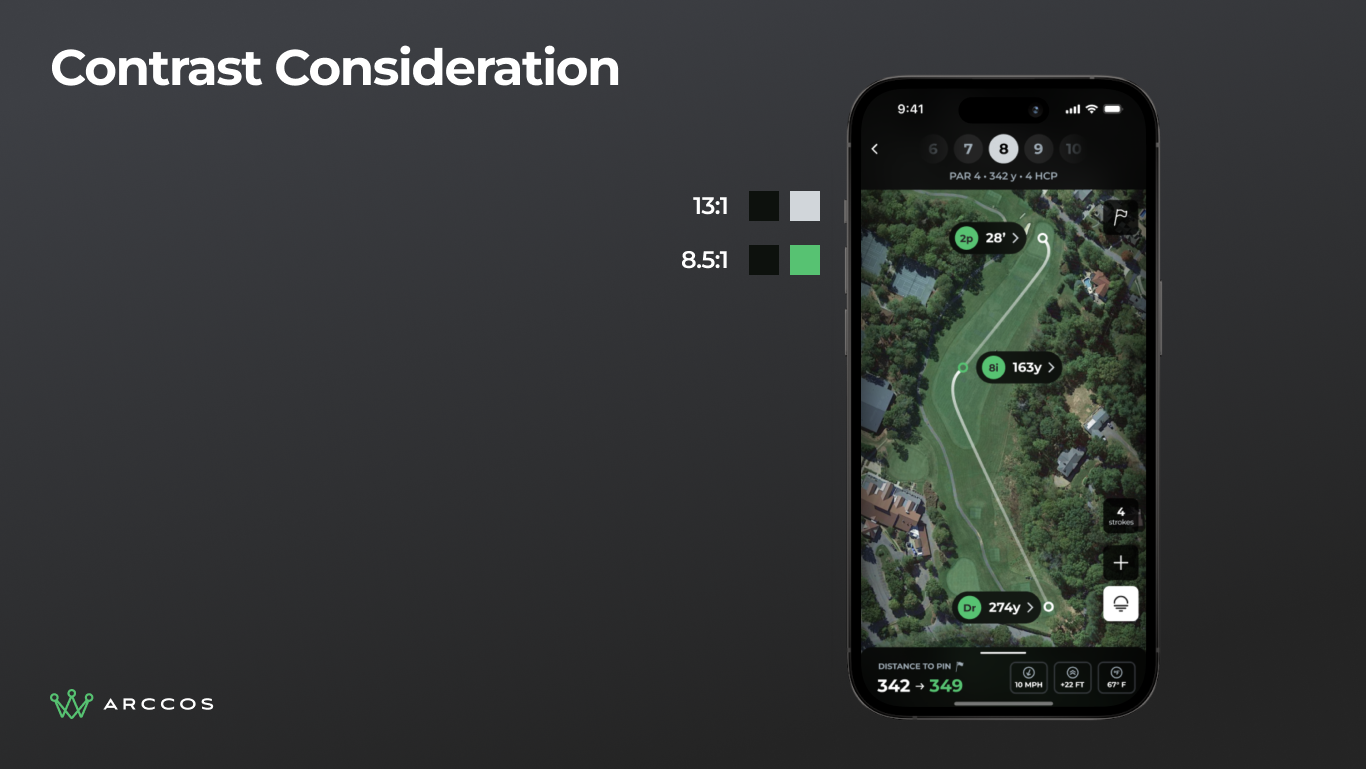
Contrast ratio specifications showing 13:1 and 8.5:1 ratios on key UI elements, above WCAG compliance standards.
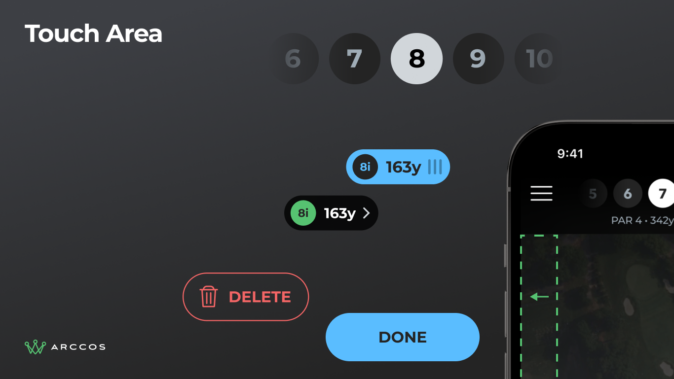
Touch target specifications showing 44px minimum tap areas on all interactive elements, designed for use with golf gloves.
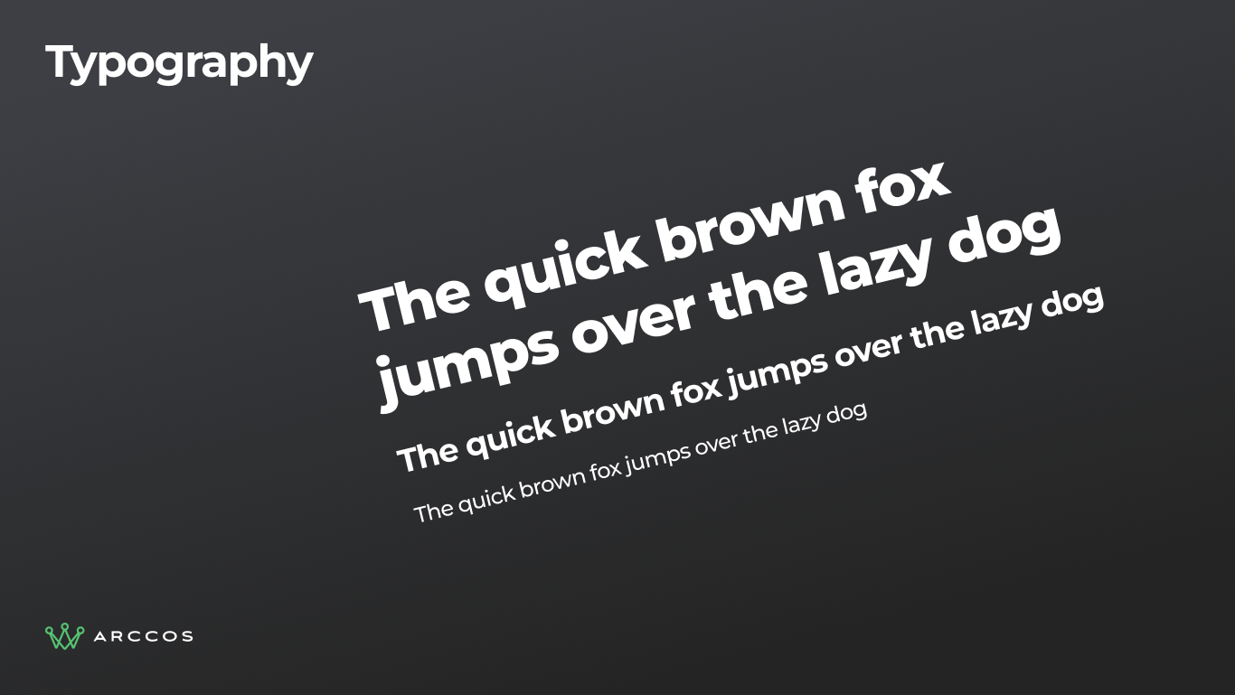
Typography system showing the weight hierarchy optimized for readability at arm's length in outdoor conditions.
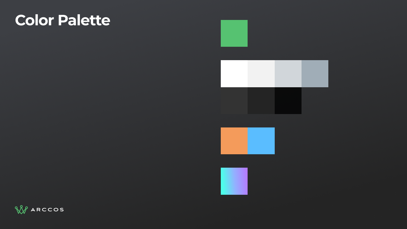
Color palette showing functional, contrast-optimized colors that map to real-world golf course features.
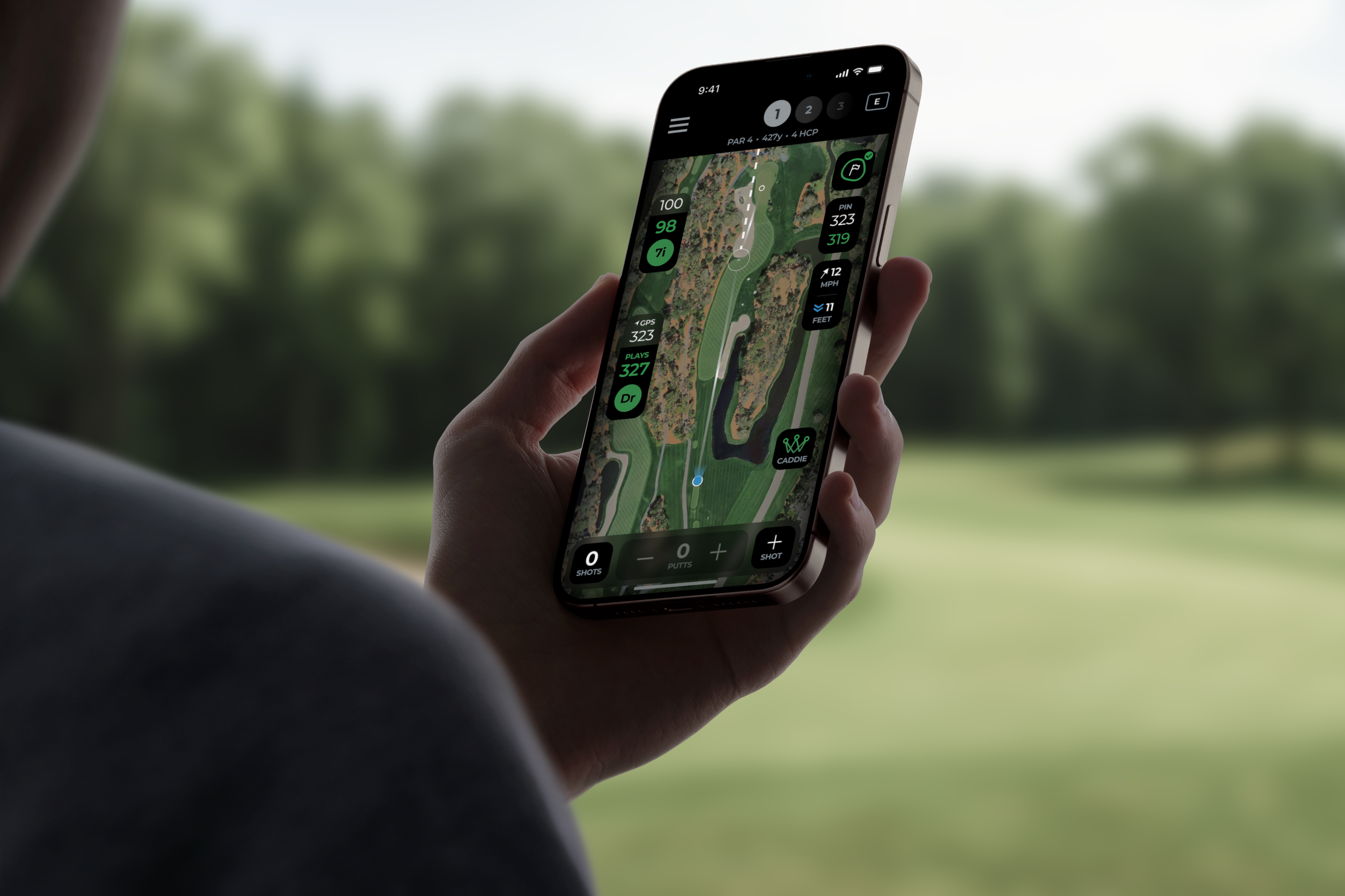
The Navigator
Same information as before: hole number, par, yardage, handicap. Completely new presentation. The navigator uses a carousel pattern so golfers can swipe between holes without leaving the map view.
We reduced the vertical footprint so more of the actual hole is visible. The header also adapts contextually: when you're in "add shot" mode, it shows that state instead of repeating navigation you don't need in the moment.
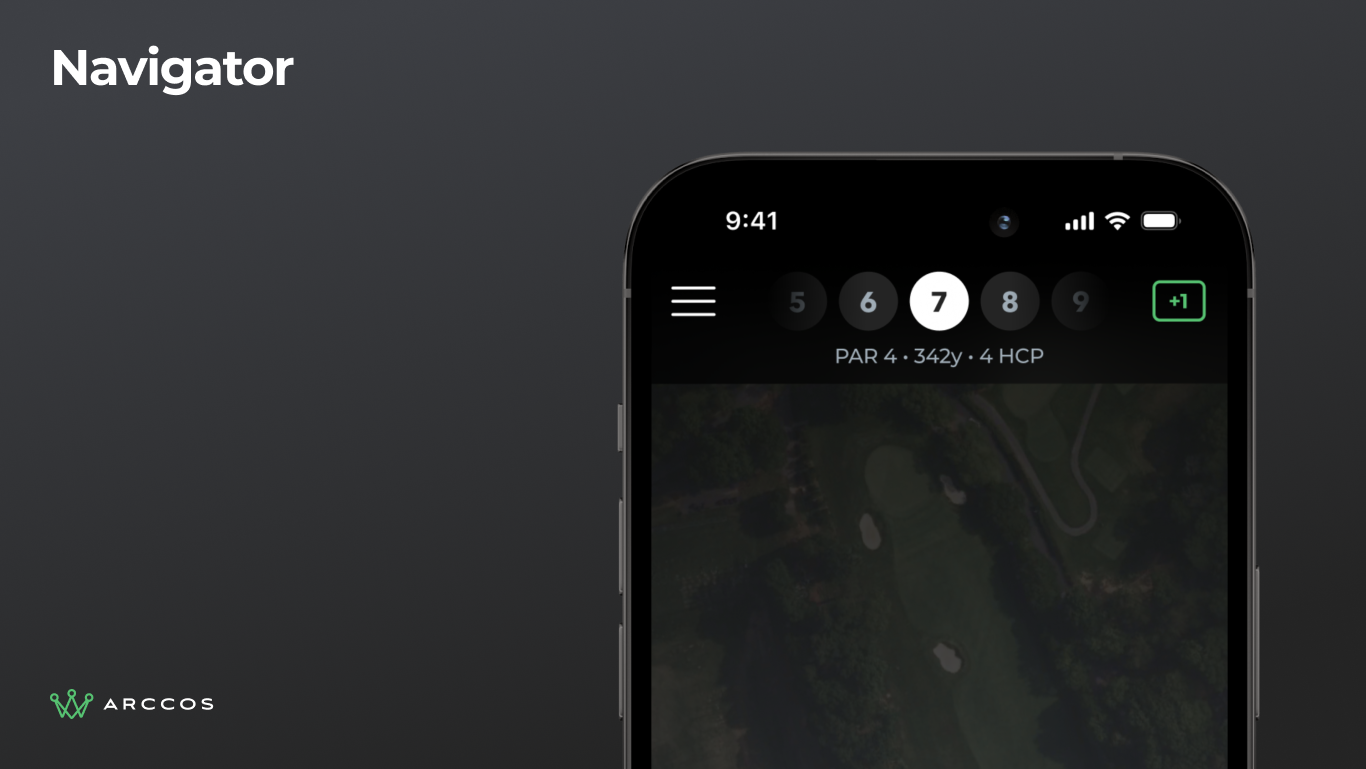
Navigator bar detail showing hole 7 with par, yardage, and handicap in a compact carousel pattern.
Live Maps
We replaced the static map with a live, interactive one. Pinch to zoom, pan to explore, tap to act. The map is the primary interface.
See a shot in the wrong spot? Tap it. Want to add one? Tap the map. This direct manipulation model eliminated what made the old app so frustrating.
Auto-zoom frames the player's current situation automatically. No manual zooming to find your ball after walking to the next shot.
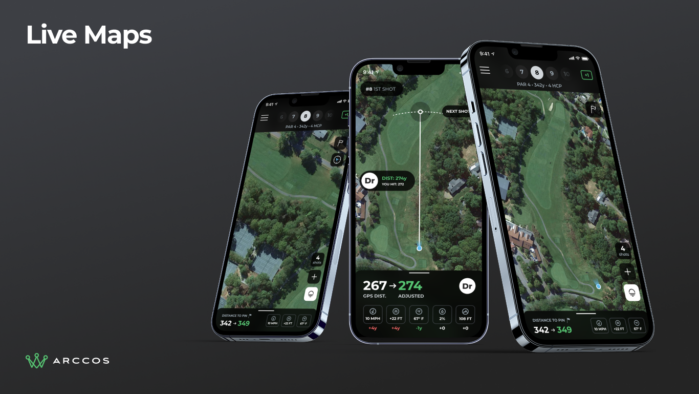
Three phones showing live interactive maps on different holes with yardage overlays and shot markers.
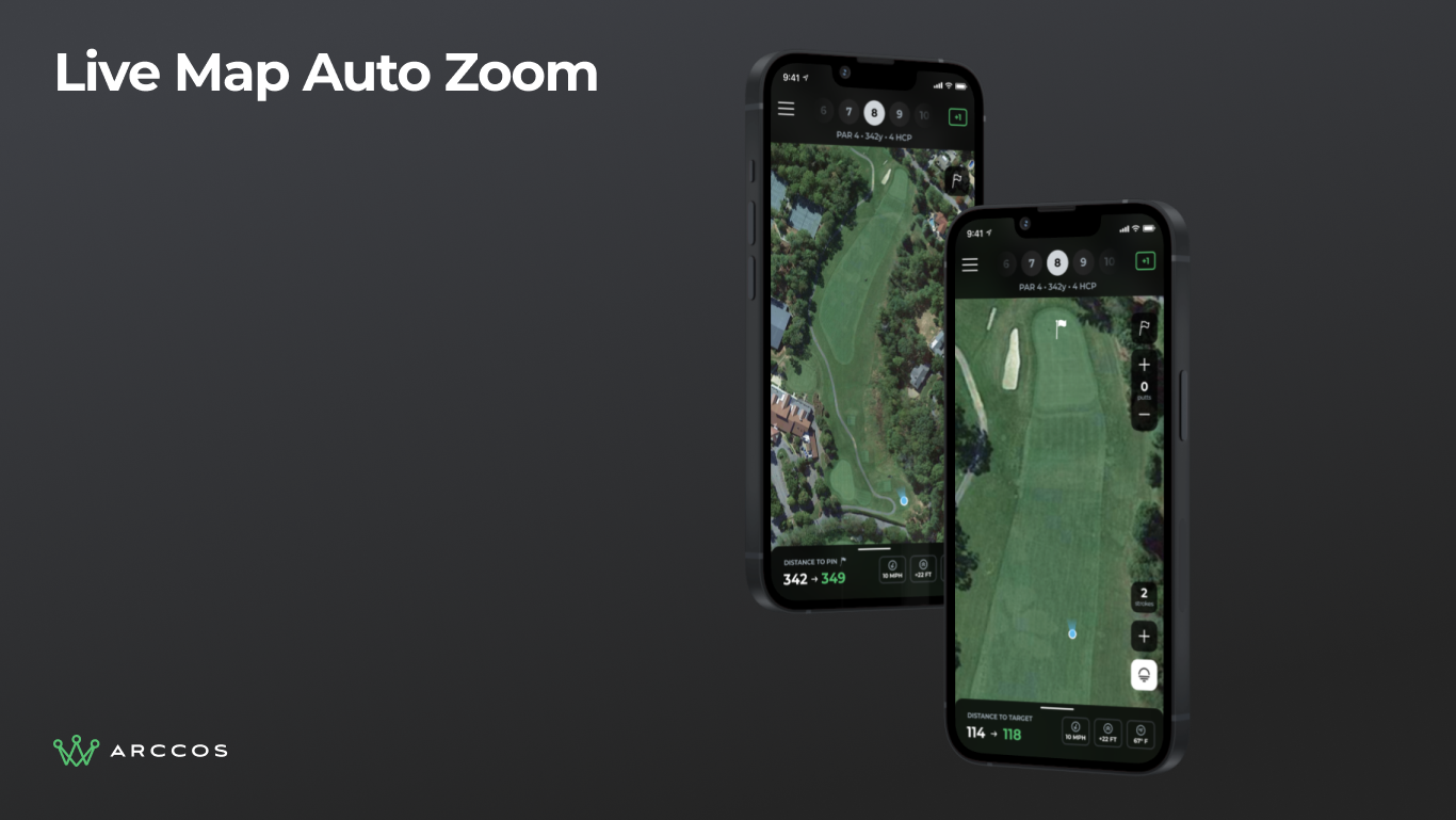
Auto-zoom feature automatically framing the player's current shot position for improved visibility.
Shot Management
This directly addresses the number one cancellation reason.
Add Shot is now a top-level action. Tap the button, tap the map. No menus, no modes to enter and exit.
Edit Shot is one tap away. Tap any yardage tag on the map to select the shot, then edit club, penalty, and lie from one panel. Drag the shot to reposition it right from edit mode.
The Shot List does double duty. The stroke counter button opens a slide-up list of every shot on the hole. Pull it higher to see the full round. Edit any shot property at the hole or round level.
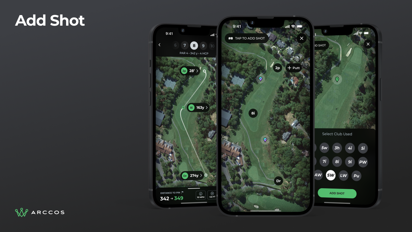
Add shot flow showing TAP TO PLACE SHOT header with the action surfaced at the top level, no menus required.
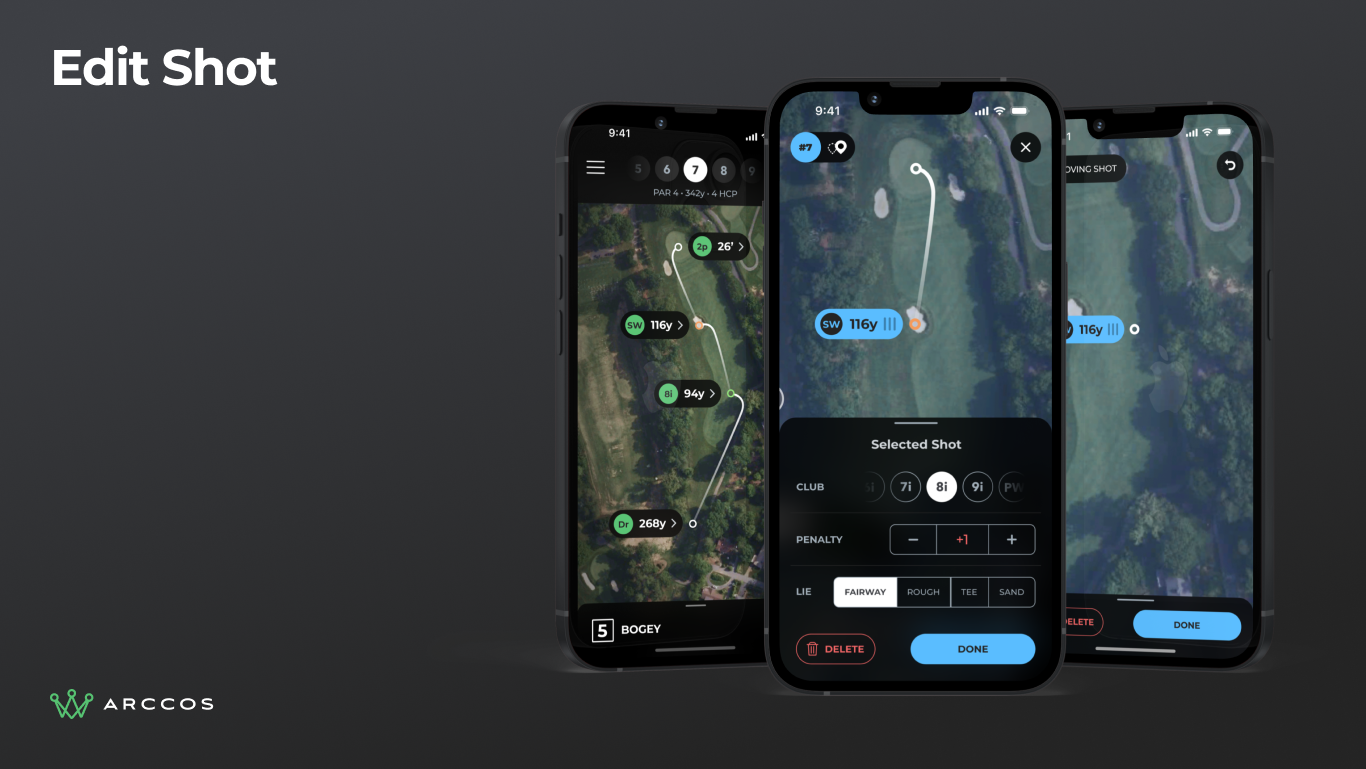
Edit shot flow showing tap-to-select on a yardage tag with inline editing for club, penalty, and lie.
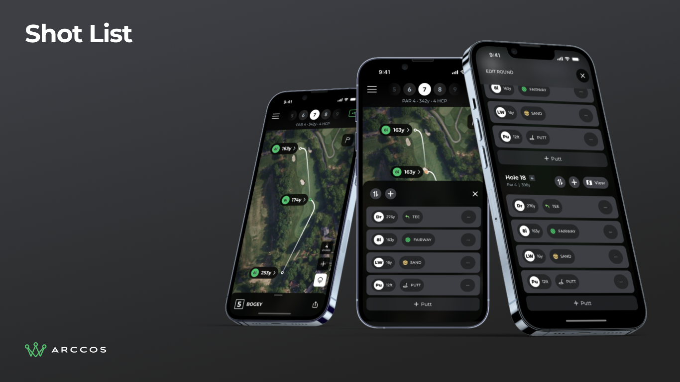
Shot list slide-up panel showing a dual-purpose stroke counter button that reveals the full round history.
Contextual UI
The bottom tray adapts to where the golfer is on the course. Standing on the tee? It shows front, middle, and back distances. Near the green? It switches to pin distance. Pull up to expand, swipe down to collapse.
Action buttons change based on the situation. The most-used actions (set pin, add shot, view shot list) stay surfaced. Everything else lives in a tools overlay one tap away.
Reach zones overlay colored arcs on the map showing how far you can hit with each club. It turns abstract yardage into something easier to read at a glance.
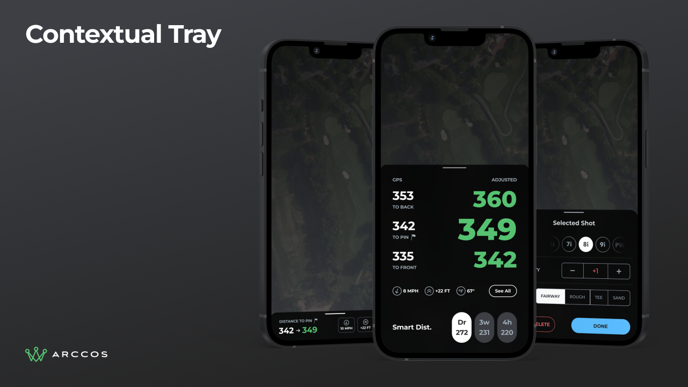
Three phones showing the contextual tray adapting to different course positions: tee distances, fairway Smart Club recommendations, and green pin distance.
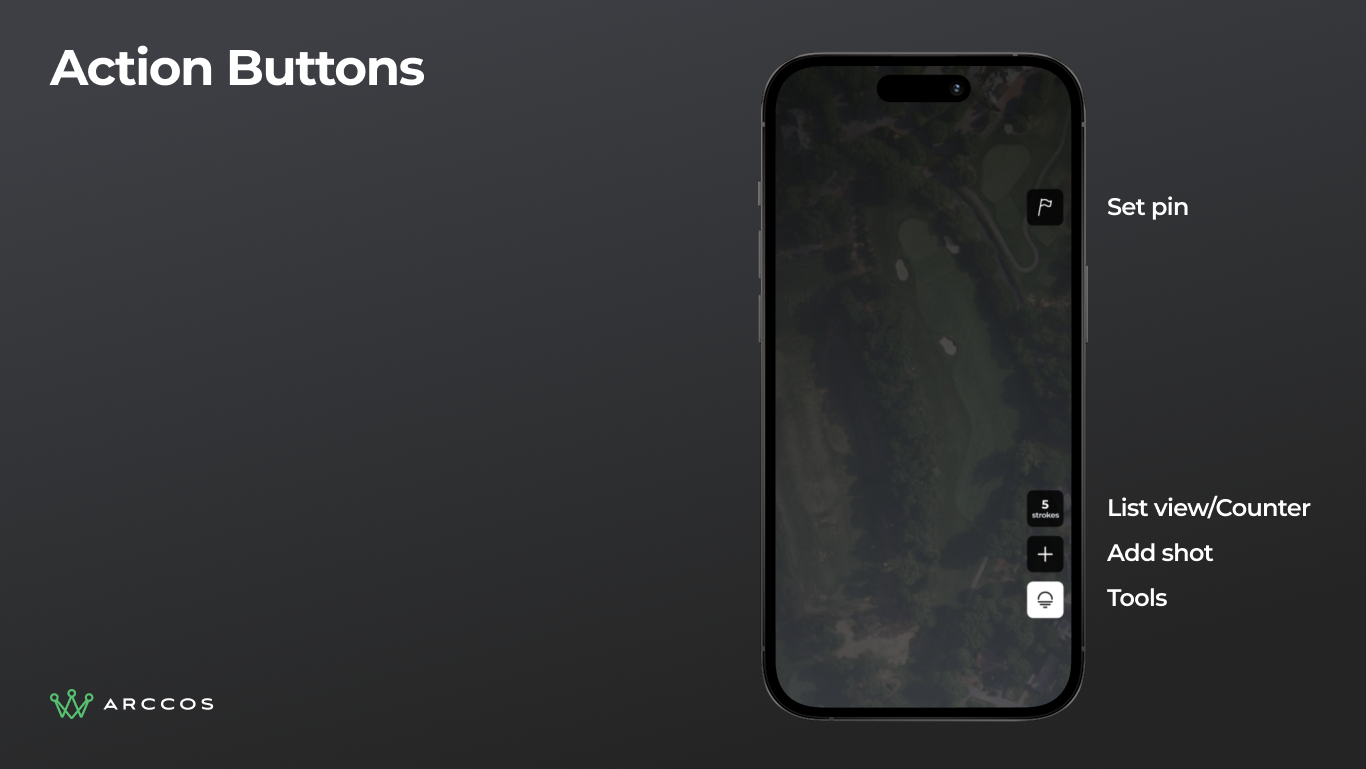
Action buttons panel showing Set Pin, List, Add Shot, and Tools as persistent right-edge controls.
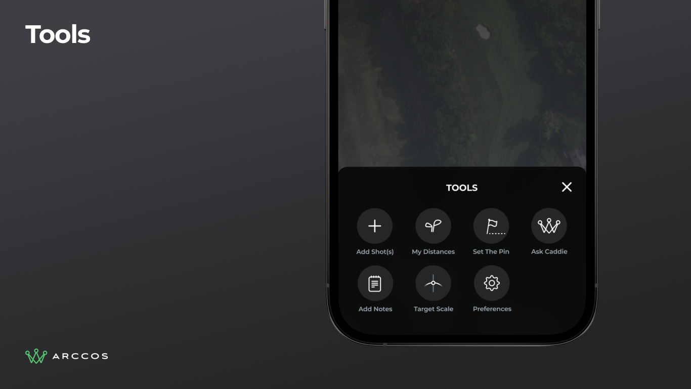
Tools overlay showing secondary actions (Add Marker, My Distances, Timer, and more), accessible in one tap.
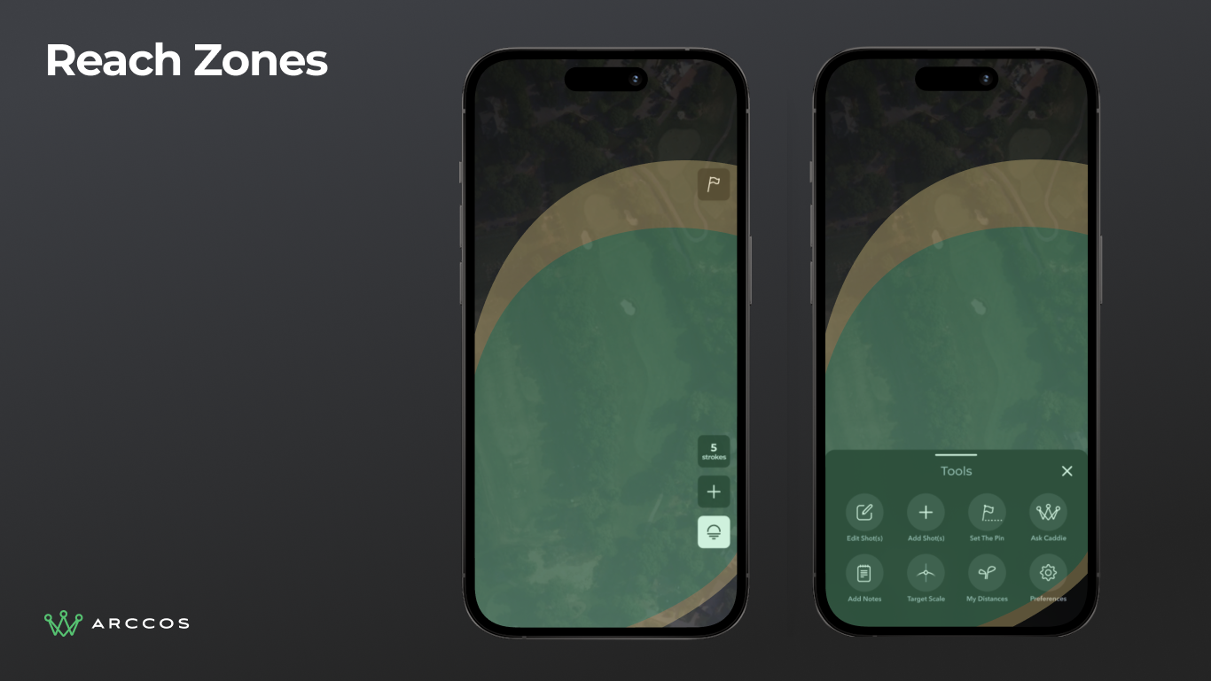
Reach zones showing colored arc overlays on the map indicating distances achievable with each club.
A System, Not Just Screens
Rather than designing one-off screens, we built a component system that could grow with the product. Every element (from distance badges to shot markers to tray states) is a reusable component with documented behavior.
This matters because the in-play experience isn't one screen. It's dozens of states across varying conditions. A system keeps it consistent when new features arrive.
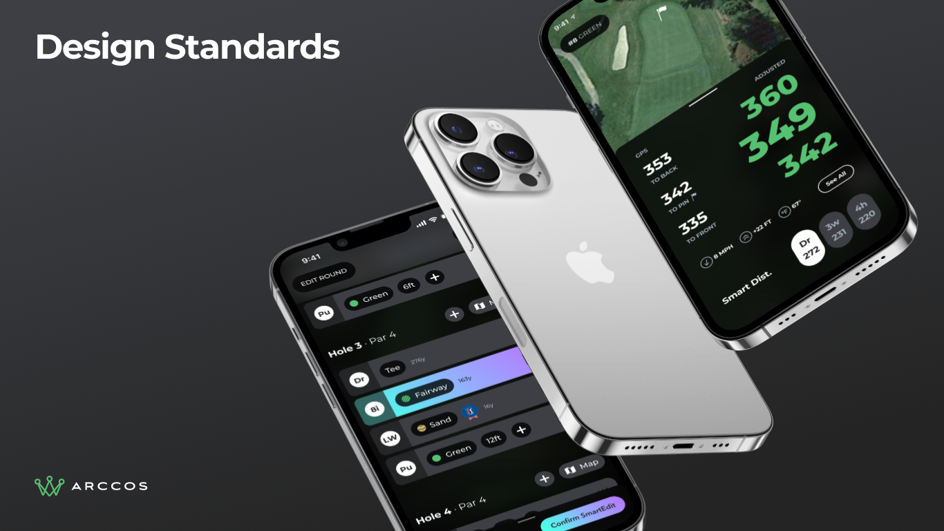
Design standards beauty shot showing premium hardware mockup with the component system applied.
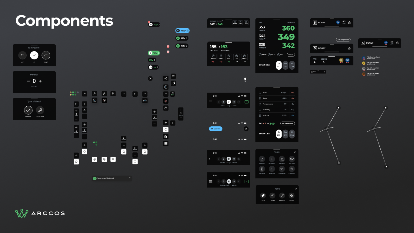
Full component library overview showing the reusable elements that make up the in-play experience.


